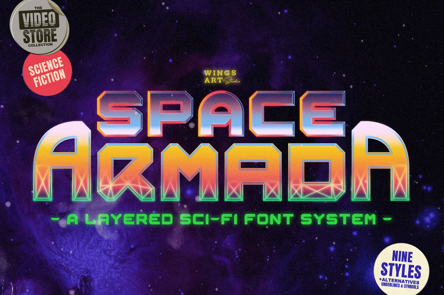
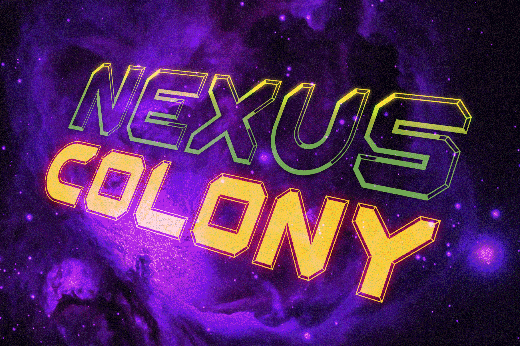
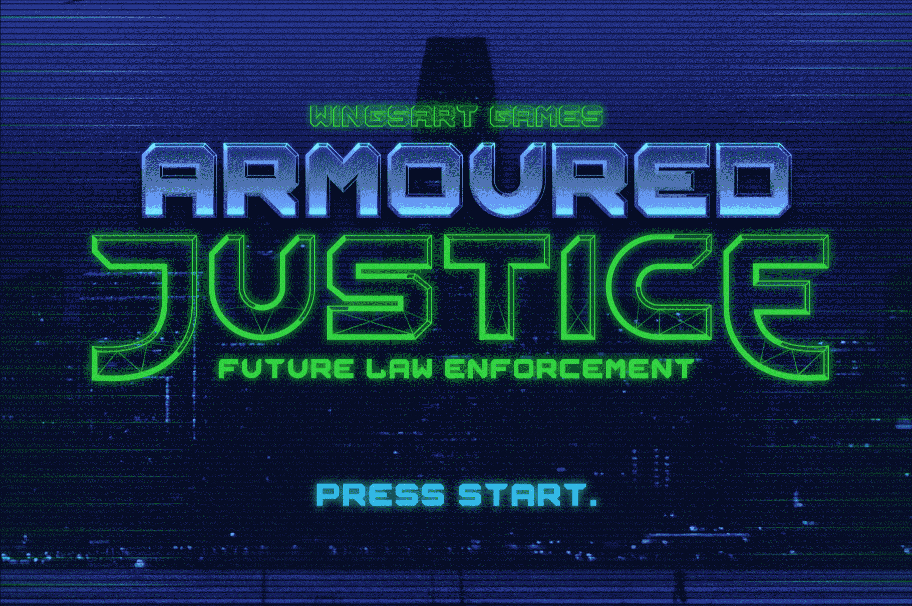
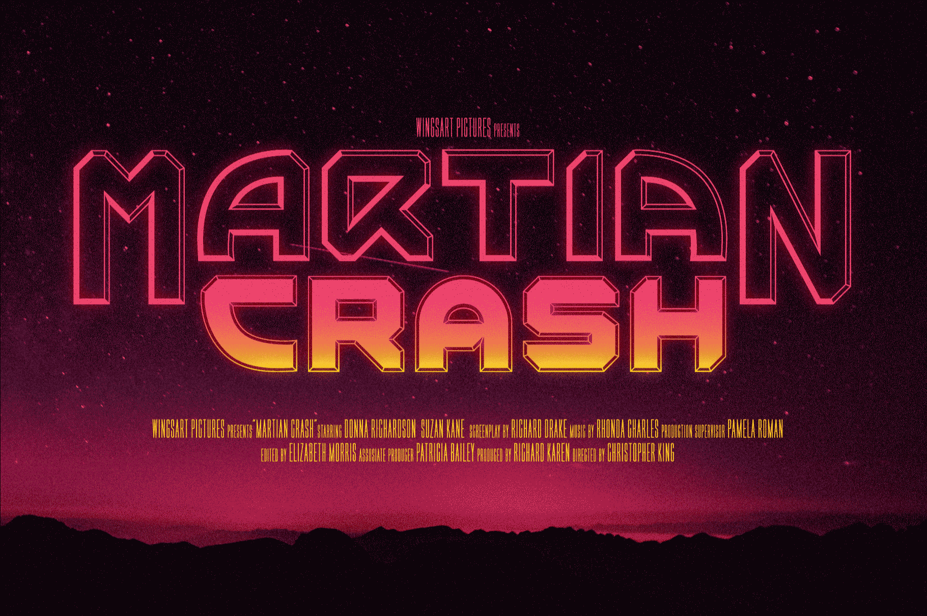
Space Armada – A Science-Fiction Font for Out of this World Designs!
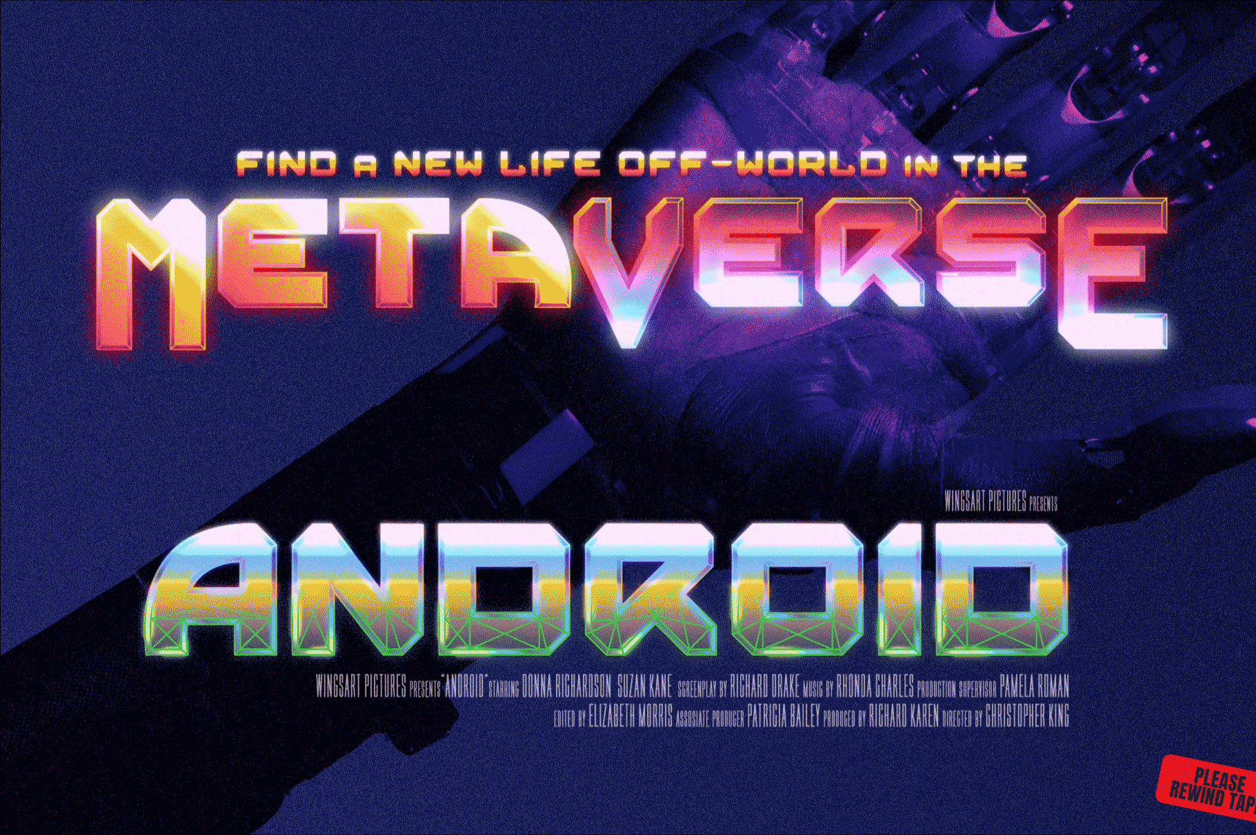
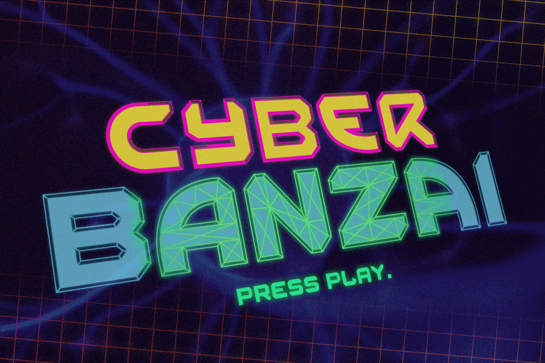
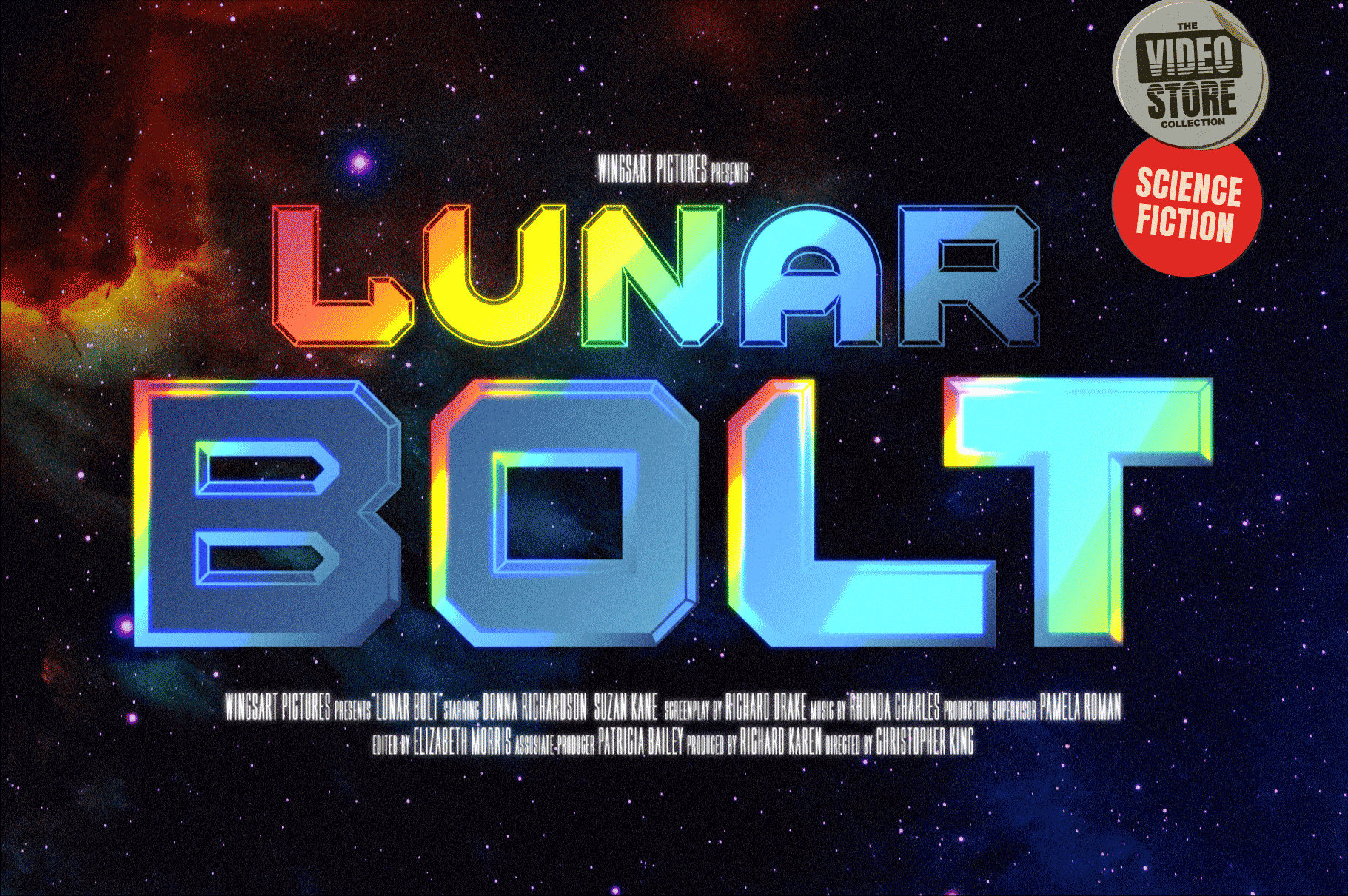
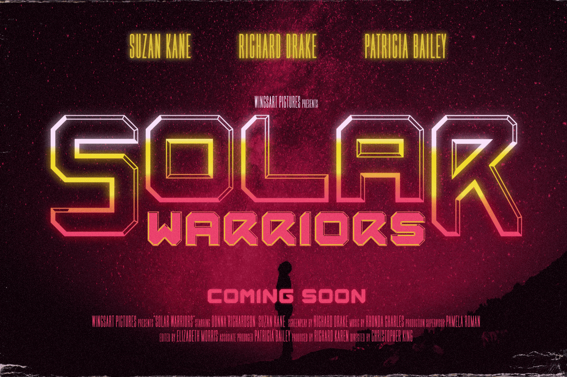
Space Armada is inspired by a 1980s interpretation of the future, referencing blockbuster sci-fi action movies of the period, along with the emerging video-game consoles and home computer technologies.
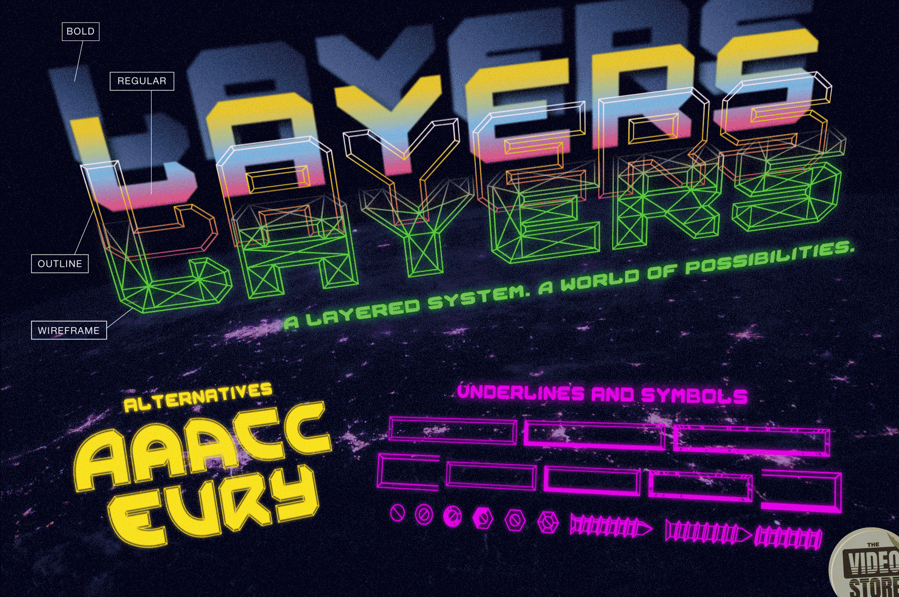
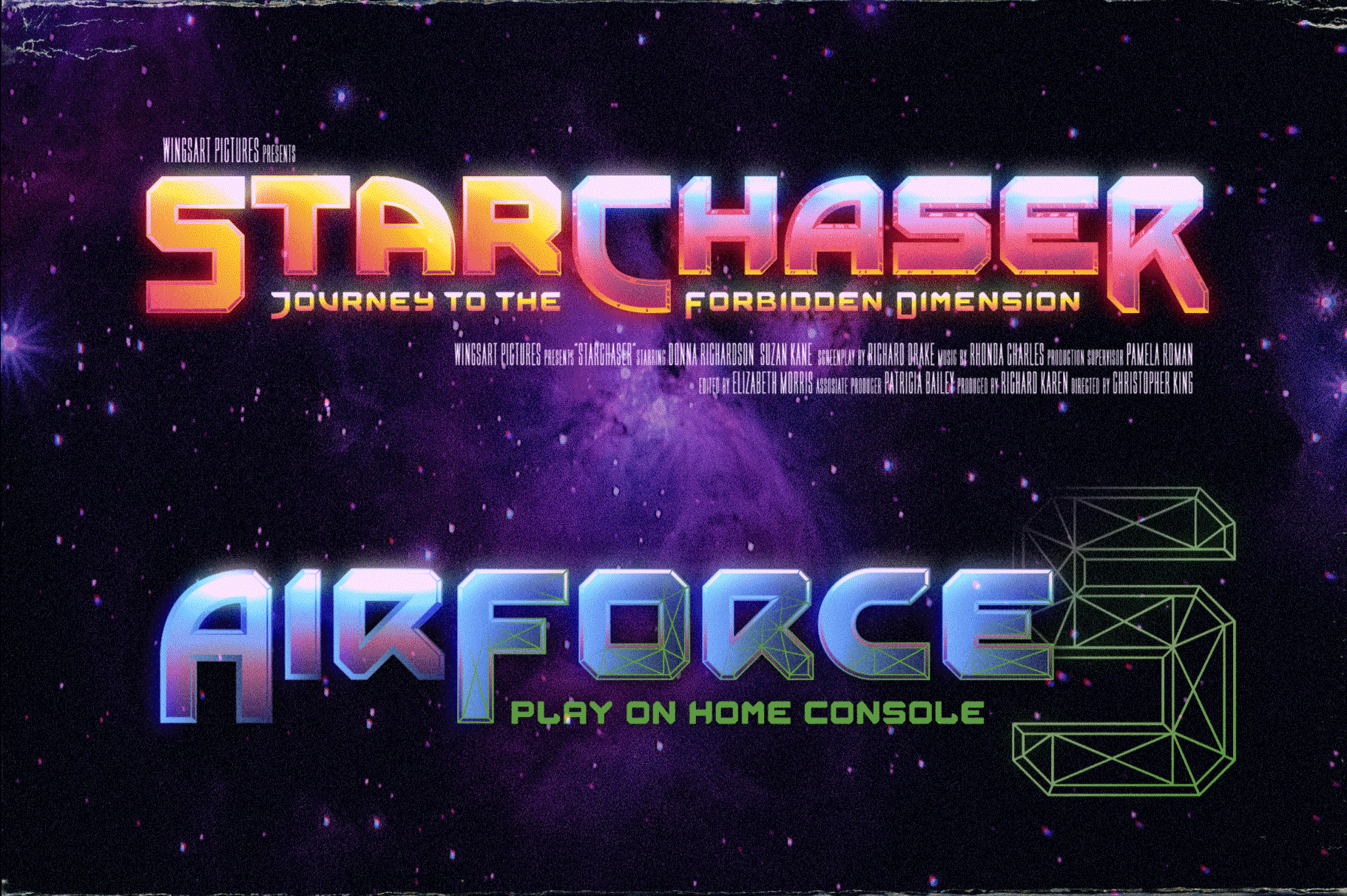
It’s nine unique fonts are designed to work together in a variety of ways, so you can layer it’s different styles on top of each other to retro-futuristic effect!*
Read below for an example of how it works.
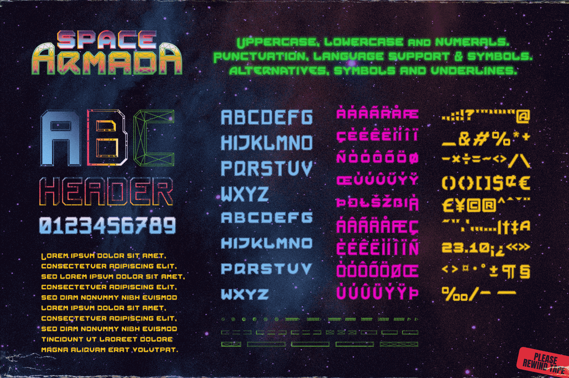
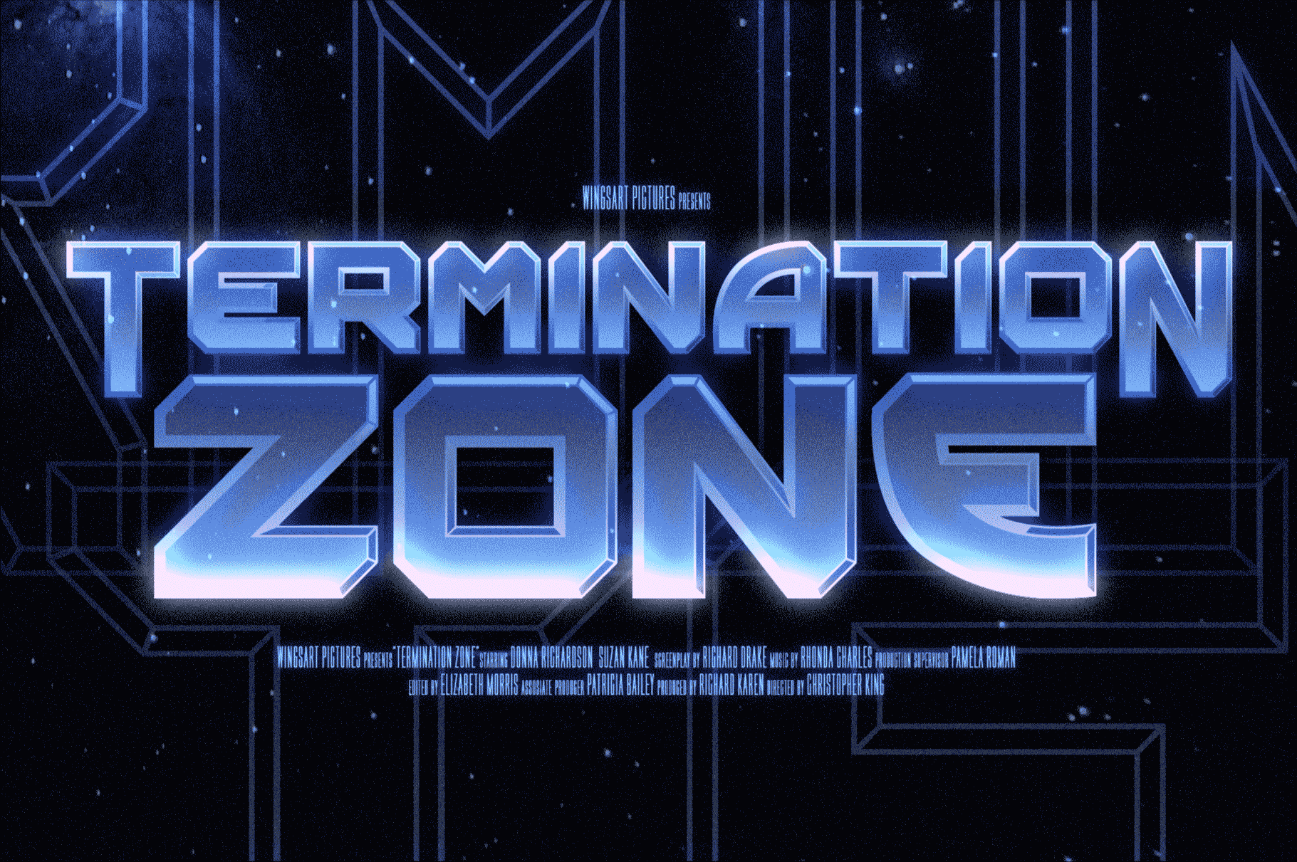
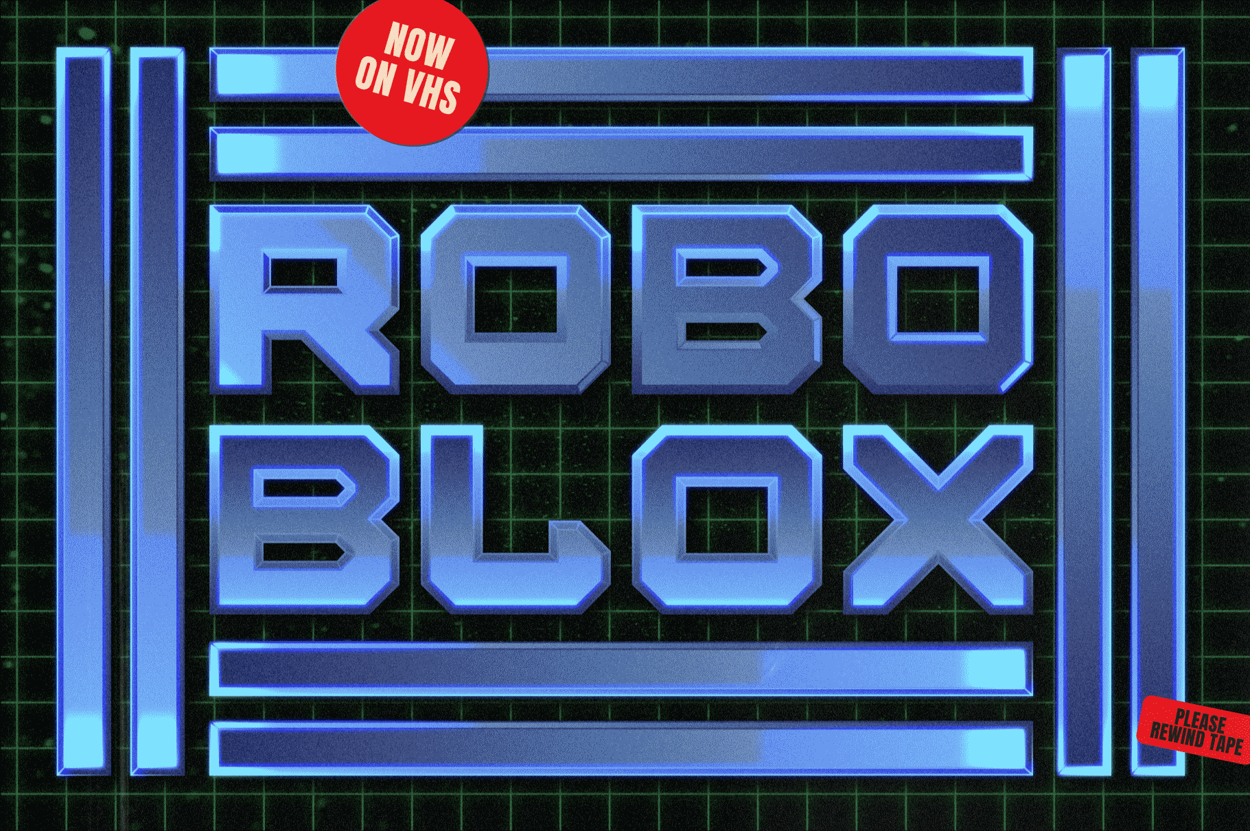
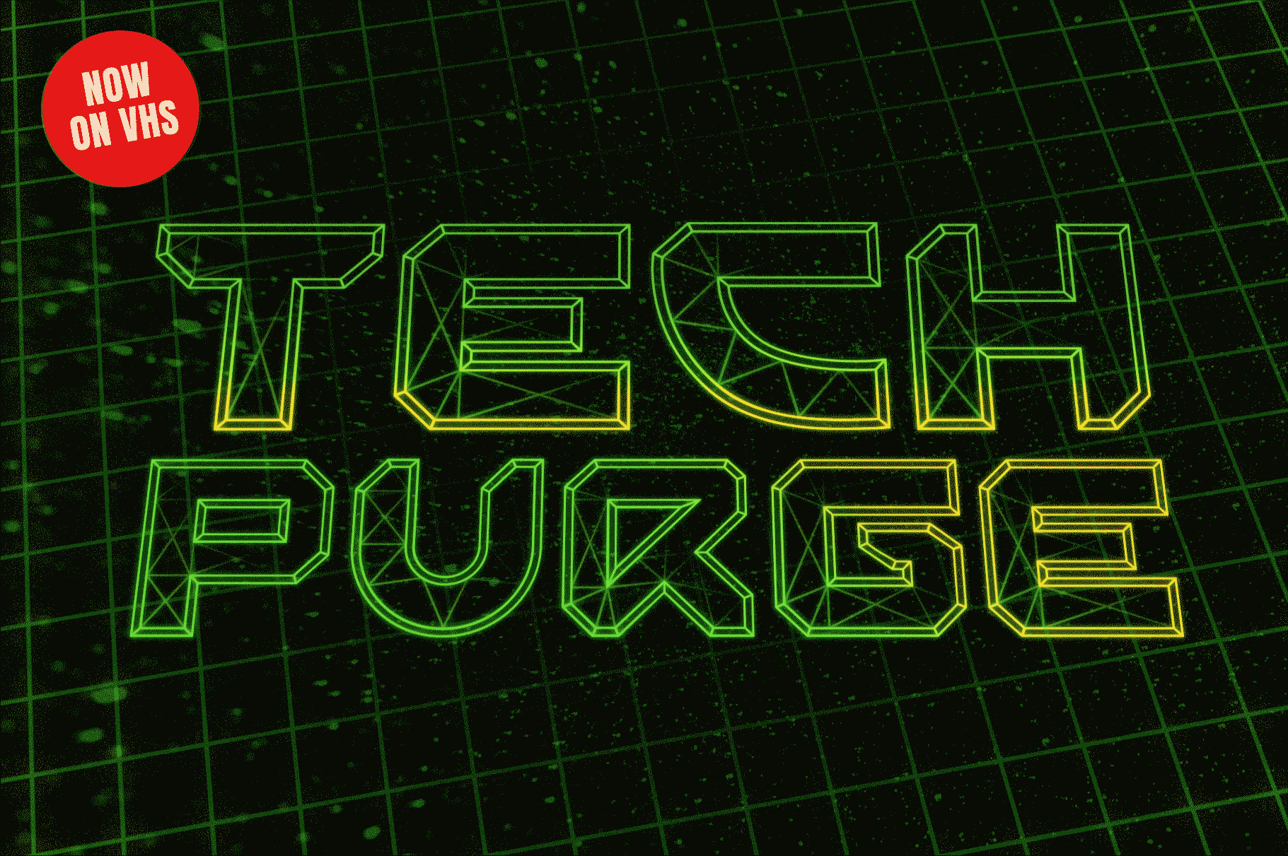
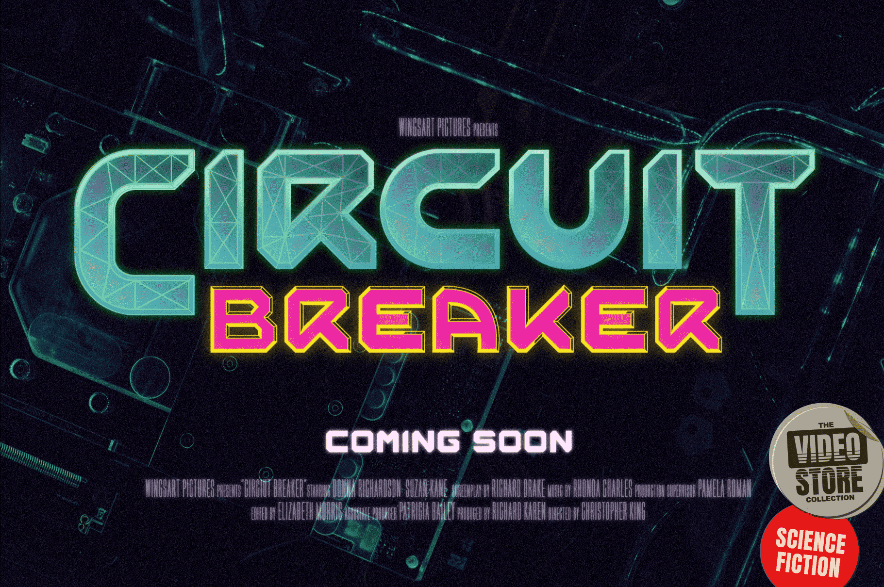
Space Armada is an all-caps font with unique uppercase and lowercase characters, along with a range of alternatives for experimentation with different looks. It also includes punctuation, numerals and language support, plus a selection of underlines and symbols. It’s a highly customisable font, perfect for retro designs such as movie titles, posters, games, book covers and more!
Contents:
- Regular
- Bold
- Wireframe
- Outline 1
- Outline 2
- Outline 3
- Fill 1
- Fill 2
- Fill 3
- Xtras**
- Preview PDF
- OFT, TTF and WOFF Formats
**Assigned to keys: abcdefghijklmnopqrstuvwxyz123456789
*Every care has been taken to ensure that all fonts align perfectly when layering. Due to the variations in how different software handles text tracking, some minor tweaking may be required for pixel perfect alignment.
Many thanks to the photographers at Unsplash for the images used in these visuals.
How It Works: Taking Advantage of Layers.

I’ve created this demo in Photoshop, but the same principles apply to your software of choice. 1. Start by placing your text using the BOLD font option. This will act as the base for all future layers.

2. Create a new layer and place it above the BOLD layer. Keeping the text in the same place on the artboard, change the font choice to REGULAR. This should sit centre to the layer below creating a simple outline. Change it’s colour if you can’t see it.

3. Using a Gradient effect, add a colour blend to both the BOLD and REGULAR layers, each flowing in opposite directions to create contrast and light. Pick your colours to suggest a striking chrome or metallic texture typical of 80s movie titles.

4. Add a new layer (copied from either of the previous layers) and select one of the outline options available. Here I have chosen OUTLINE 1. Add a contrasting gradient to this layer too to continue the effect.

5. On another duplicate layer, select the WIREFRAME font option. Apply a bright colour either as a gradient or fill. A bright neon green is great for an electric look. Adding a glow to this layer further enhances the effect.

6. Add additional texture and grain layers to finish the piece. Here i’ve overlaid some stars from a stock photo with a Linear Dodge layer blend, and adjusted the Curves to bring out the highlights. You can experiment with this Photoshop file yourself by clicking on the download link below.


